Tiny Tip: New York fashion week top colours for 2026

Tiny but impactful jewellery tips from jewel & i
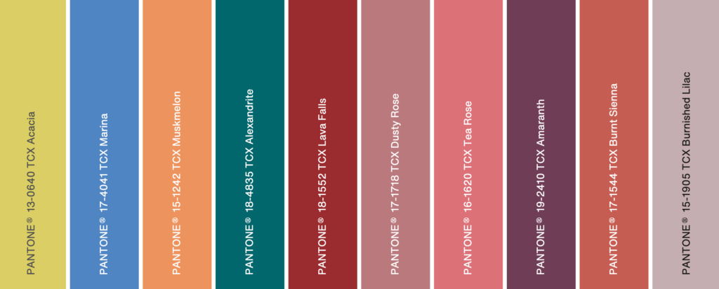
When the fashion industry shifts towards certain tones (say, earthy neutrals or dopamine brights like above), consumers subconsciously start craving those colours everywhere – including their jewelry! If your jewelry aligns, it instantly feels fresh and desirable, even if buyers can’t say why.
Take a look at these stunning colours from the New York Fashion Week Spring/Summer colour palette, it blends soft, grounding shades with confident, statement brights. Acacia yellow with Marina blue, or a gentle Dusty Rose sitting next to a deep Lava Falls red. It’s less about matching and more about personality and contrast. I love them, Burnt Sienna is my fave… or is it Tea Rose 🧐…oh i love them all!
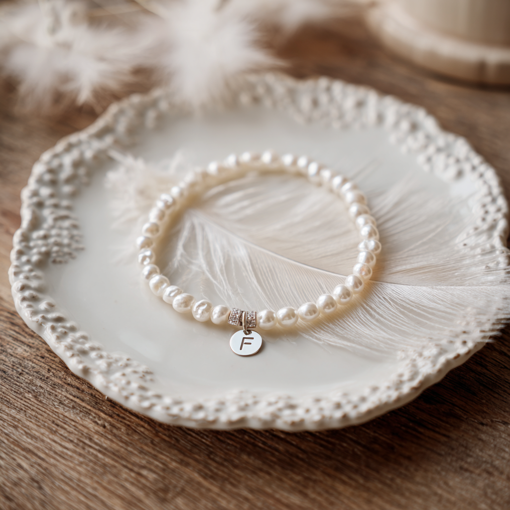
So, when you’re designing, choosing or making your jewelry, why not pair one comfort colour with one bold shade you would not usually pick. Your trusted neutrals (Dusty Rose, Burnished Lilac) suddenly feel modern when you add a single bead in Alexandrite teal or Amaranth, your piece could look so wantable! 🤗
This season leans toward individuality, so let your jewelry reflect that. Balance quiet tones with one shade that feels a little daring. Calm colours, one confident accent. That’s Spring/Summer 2026 in jewelry form!
Go create something beautiful, and don’t forget to share it! I’d love to see how these colours come to life in your designs. Keep an eye on the catwalk for your next palette tips, or pop back here – I’ll be sharing more colour ideas soon.

If you’re curious about the tools I use daily, take a peek at my resources page